Blog
Return to Blog »
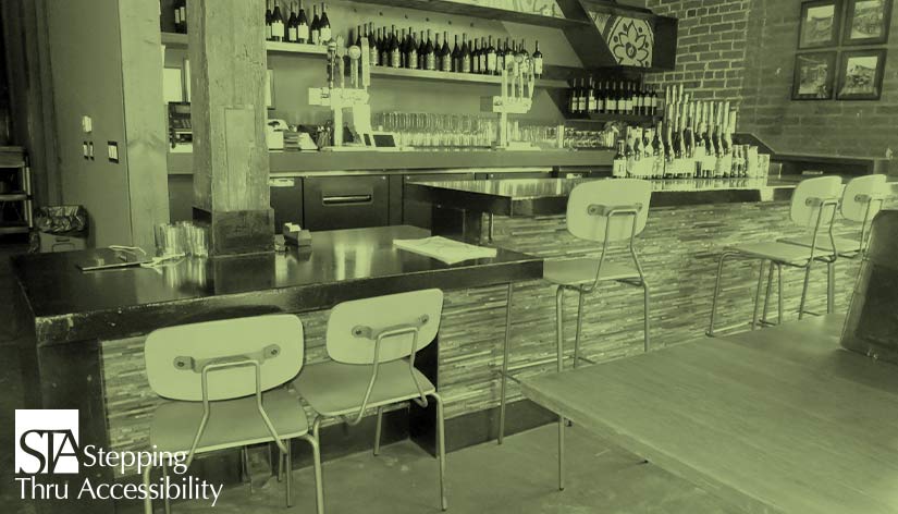
Janis Kent, Architect, FAIA, CASp © March, 2021 Some of the main issues for restaurant, bar, and cafeteria design have to do with circulation paths, accessible routes, and counters. This is in addition to parking, entries, and restrooms, of course, which are typical for all projects open to the public. The more these specific issues are understood and incorporated into the early design stages, the less institutional the Access solution for the project will feel. This also has benefits for all customers who come to the facility, not just those who need extra clearances. One of the specific issues for consideration is providing enough space for seating both at tables and counters (whether standing or sitting) and how this impacts circulation paths. This should be designed in such a manner that a person at a table or counter seated in a wheelchair is not within the minimum required aisle space, and preferably not in the aisle at all, which is more often the case when not fully integrated into the design. Counters are another issue, whether a reception counter or hostess stand, an order or check-out counter, or a standing ledge or sit-down bar. These or a portion of them are to be at a specific maximum height. Even though people do not generally write at hostess stands or reception counters, if the counter is higher than what is allowed, vision is blocked not only for someone in a wheelchair but also for someone who is short of stature. Order and pick-up counters have similar requirements including reach range as well as visibility, which is also true for buffets and condiment counters, with the latter having a few more additional parameters. A bar, whether standing or seated, is best lowered. But if only a portion is lowered to 34″ above the floor, be sure to provide appropriate counter height seats rather than table or bar height seats. Do include a space for a seated companion at the lowered portion so they can converse with eye contact. Also, if a lowered section of a counter is designed for seating or standing, be sure this is not at the end of the counter which typically is used for staff as a service counter and creates a conflict. Visibility should also be taken into account at food service line counters where people view the food but do not serve themselves. Another element to consider is the furnishings. More often than not, a table with a center pedestal will not provide enough clearance below due to the base. Fixed tables can be set into the floor with a post and sleeve without a base, which can work if the table-top is sized large enough for knee/toe clearance below. Another solution is to use cantilevered tables or tables with legs or trestle bases, being sure to provide 30″ minimum clear width at any point. Do be careful of tables with supports, that the required clearance height of 27″ minimum is maintained for 30″ wide and 17″ deep (19″ per CBC) minimum. A number of items to consider. And when providing the number of required accessible tables, remember the seating is to be dispersed – so do not place the accessible seating at the same table if more than one space is required. Furniture, whether tables, counters, or seats that are fixed, are to be scoped separately from loose furniture. Exterior seating areas are scoped separately from interior. Rooms with different functions or decor also are to be scoped separately. Each is to have accessible seating. Count the number of seats or standing spaces and provide 5% that are accessible, rounding up if a fraction, and disperse at different tables. Oh, and one other item – it is not necessary to place an ISA at the accessible table and probably better not to do so. Restaurants, bars, and cafeterias are frequented by people to relax, do business, party, or to just get in and out as fast as possible. Generally a specific type of ambience is provided to set the tone or mood of the place. If Access is included in the early design stages, rather than overlaid at the end, it maintains and even creates the mood. Otherwise, trying to accommodate Accessible features can feel jarring and institutional if not fully incorporated. This is not only true for moving thru the space but also includes the furnishings as well as built-in elements. And in this day and age with the plague – when people are seated, we should have the ability to space seats at least 6′ away from other seats at adjacent tables. We can design higher barriers at banquettes that have back-to-back seating which can also add separation. Hopefully, at one point this may change and we can have denser seating – so design to take both into account for both interior and exterior areas. Nothing in this article constitutes legal or design advice for a particular project or circumstance. Be aware that your local City or County may have additional requirements that are different or more restrictive than the State or Federal requirements. Also, this article is an interpretation and opinion of the writer which may vary for a particular project or due to other circumstances. It is meant as a general summary – current original regulations should always be reviewed when making any decisions and specific advice by a qualified professional should be secured for a particular project or circumstance. © Janis Kent, FAIA, Architect, CASp 2021Restaurant, Bar, & Cafeteria Design Considerations

Counters
Furnishing
In Summary