Blog
Return to Blog »
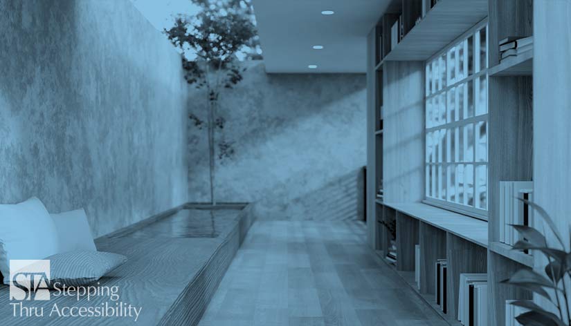
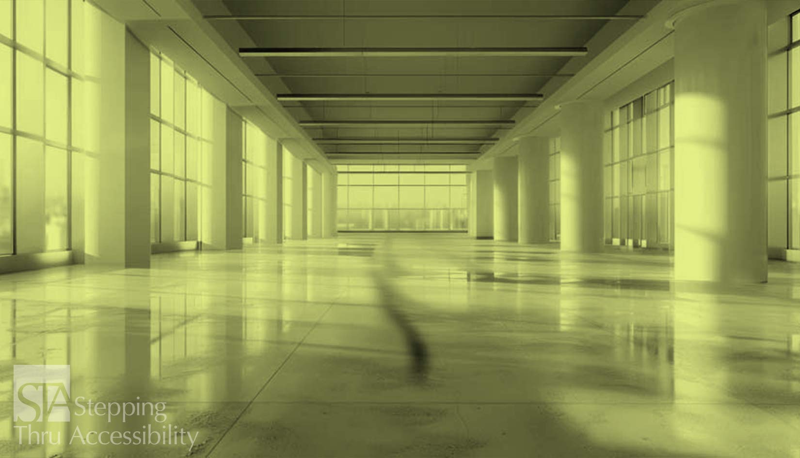
Janis Kent, Architect, FAIA, CASp © June, 2024 When providing spaces in architecture and the outdoors, for the most part, we are problem-solving, whether it is about budgets and programming, or codes and access. Generally, we are designing in order to fit elements into a space to meet project requirements. But what happens if space is also designed to emit emotion, whether it is awe, comfort, protection, quietness or just ease of movement through space. Our environment will trigger certain emotions which can also trigger certain behaviors. This can be by color and texture or it can be by proportion of the space itself. It can also have fragrance and sound such as a specific aromatic plant, or water feature either on the exterior or interior. If a space has many elements it can feel chaotic, just as on the other hand, if it is a sparse monochromatic space, it can feel institutional. Neither of these spaces are comforting or calming, if that is what is actually needed. If a floor, walls, or edges of a space have a lot of texture, one may want to spend more time there absorbing the texture, visually or by touch, as opposed to these elements being monolithic and smooth, where you may want to move thru quickly because there is nothing to see, touch, or feel. The reason I bring this up is, knowing how to control these interactions in the environment is important. Think of your own emotion to a water feature – if the water is a crashing waterfall, you will have a very different reaction than one that sounds like a trickling stream. Bright contrasting colors everywhere will feel different than muted colors with specific contrast. Bright lighting feels different from low lights – just think of a cafeteria with bright lights versus a romantic dinner at a restaurant with muted lights. Large rooms with high ceilings will feel different than low ceilings in smaller rooms. Understanding this can greatly assist with designing for specific groups of people, whether neurodiverse or other and for specific purposes. But the first step as designers and those living/using the space, is to understand how it makes you feel and how you want it to feel. In terms of generalization, if you have a room or corridor with very high ceilings, this might give a sense of grandeur. This can get reinforced with hard materials such as metal and stone. If you have a niche with lower ceilings and light levels and soft surfaces for flooring and seating, this may give a feeling of protected comfort, a place to relax. Years ago, I taught a class to designers. The assignment was to design a different room each week in a house. The intent was to explore the feeling or psychology of the space that it emits, as opposed to how each of the rooms relate to each other. The task was to find a photograph that gives a certain feeling. Then they were to design that room to achieve that feeling. I had one student who had a photograph of a red/orange hot sun – passionate. Another had a photograph of an edge of a moss covered bank at a quiet stream – calming. The measure of success was to present the photo, describe the feeling, then to show how the design of the space gave the same feeling. At the beginning, it was a challenge, but by the middle of the semester, they really got it. How do you communicate and achieve feeling within a space? That is the question. So where does this lead us? If space is in a hospital waiting area, one might want to consider a calming/soothing affect, perhaps one with a water feature with a low sound of trickling water and maybe some delicate planting. For those who are on the spectrum, having a calming space assists with independence and comfort level. This is particularly true in facilities that are naturally chaotic, such as an airport terminal or train station, and can make travel much easier. And note, a calming space is NOT a room with 4 white walls – that would feel more like a prison. If the space is in a lobby that you want to make grand and have people move thru quickly, perhaps a ‘crashing’ water feature on one wall and less detail to the flooring and walls so people tend to move thru more rapidly. A study in 2020 on veterans who have PTSD had several suggestions for making spaces more comfortable. Some had to do with being able to more easily observe their environment without feeling trapped. This included areas with large windows rather than enclosed spaces. Also being able to observe entries and exits from within the room as well as open floor plans without hidden niches allows a feeling of greater ease. Wider hallways were also preferable to prevent inadvertent and unexpected physical contact with other people. If one reviews the DeafSpace Design Guidelines, one should try and avoid as much as possible opaque corners in buildings and use translucent material or rounded corners so you can see someone charging around the corner. But with this, you can see there is an overlap of hidden niches and corners, albeit for different reasons. There is much more for designing for this broad group of people who rely on vision for communication. If we are considering the oldsters, having more light is better. A 2001 study discusses the amount of recommended light levels depending upon task and how it needs to increase as the eye ages. Light levels also need to transition from a brightly lit area to a darker area such as going from the outdoors to the interior. Contrast items by color, not by light levels, but be aware, as the eye ages, there is difficulty in distinguishing certain colors and ability to quickly adjust to different light levels. Being able to use a space more comfortably, contrast the horizontal surfaces from the vertical – in other words, do not make the floor blend with the wall color. Also having doors, electric outlets, and switches contrast with the wall is a good practice for those with limited vision, otherwise finding the switch or the door can cause discomfort and be disorienting. To summarize, understanding the psychology of space and its affect on us is very important, and the above is barely skimming the surface There are numerous studies on this which are worth looking into. Whether this is for someone who is neurodiverse, or deaf, or whether they have low vision or are aging, it is important, and be aware that there is not one answer for everyone. But having a better understanding of the psychology of space and a better understanding of who we are designing for, will help us as designers create space that is more easily used causing less stress and discomfort. Be aware that your local City or County may have additional requirements that are more restrictive than the State or Federal requirements. Also, this article is an interpretation and opinion of the writer. It is meant as a summary – current original regulations should always be reviewed when making any decisions. © Janis Kent, Architect, FAIA, CASp June, 2024Psychology of Space – and why is this important

